The Moody Spring Color Palettes Designers Love Right Now
Spring is known as a time for renewal and provides us with an opportunity to refresh our homes. There are many helpful guides to spruce up your space in time to kick back and relax during the warmer months. But here at Modsy, we think that in addition to creating a tidy and chill vibe at home, spring is also the perfect time to experiment with new home decor trends and color palettes.
Think about it— you're probably already planning to deep clean and maybe even adding some new spring decor to your space. So why not experiment with a new color palette too? Adding a fresh coat of paint can be a fun and low-lift spring activity. Plus, with all those colorful Spring flowers in bloom, it's hard not to be inspired to try on some new colors! That said, spring color palettes don't have to be all neutrals and pastels. In fact, there are much moodier color pallets and design options like Dark Academia that are super on-trend and reflect some of spring's richer, deeper, and edgier aspects. These moodier hues will transition perfectly into fall and winter, so you won't have to re-doctorate your home in three to six months.
What Are Moody Colors?
When you hear the words "moody color pallet," it might seem a tad intimidating because, well, when you think of "moody" as a descriptor, it's often about an angst-ridden teenager, not a relaxing and cozy space to call home. However, moody color pallettes can be just as welcoming as any airy or neutral space. They just add a slightly more romantic ambiance to a room.
Some quick examples of moody colors would be:
dusty hues, like deep rose-pink
dark colors like navy, charcoal, or aubergine (that's the fancy British way of saying "eggplant")
Emerald greens and other jewel tones
These colors are rich in pigment, creating a calming quality when used correctly in a room.
How Do You Select a Moody Color Pallet?
Of course, selecting the right moody color pallet for your space depends on your particular tastes. However, you can follow some general design rules to help pick one that works beautifully. We suggest following these two steps to ensure that your moody Spring color palette is design perfection!
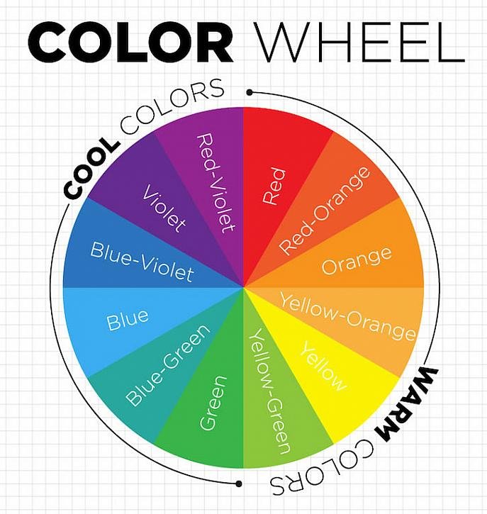
Set the mood. Want To decide which color palette will work best for you? Start by determining the overall vibe you want in your space. For example, if you want something more serene, use colors that sit next to each other on the color wheel (known as analog colors), like blue and green. Want something more dramatic? Try pairing complementary color combinations —colors that sit opposite each other on the color wheel—to create visual drama.
Balance light and dark tones. Just because you want a moody color palette doesn't mean every color in the room has to be dark and bruting. In fact, pairing darker walls, say a deep blue-gray, with lighter or more saturated accents in a complementary color, like a bright cognac-orange leather armchair, will make the room feel cheery and dynamic.
What are the most attractive moody color palettes?
Ok, so we've explained what moody colors are and why they're an exciting spring trend and even laid out some basics on creating your own perfectly moody palette. But you're probably wondering which moody color combinations our designers and customers love right now. So, without further ado, we present a selection of designer-curated and customer-approved moody spring color pallets that are inviting, glamorous, fun, and even downright cozy.
April Showers Bring May Flowers — Stormy Navy Blue and Earthy Camel
Who doesn't love the classic combo of navy blue and light neutrals? Most often used in coastal spaces with the darker color functioning as the accent, this color combination is super versatile and can pair well with any interior design style. In this transitional style home office, navy walls paired with a pale beige fireplace, coffee table, and chairs create a moody ambiance that recalls a Spring rain storm's tranquility (and drama).
Midnight Sun—Dark Black and Pops of Gold
Another moody twist on a classic color combination is this bedroom's black walls and gold accents. The pairing feels glam and sophisticated when used correctly. But to ensure it feels moody and springy, incorporate pops of white and natural elements, like a jute rug or pale exposed wood finishes. Doing this will balance the moodier aspects of the space with some sunny Spring vibes.
70's Sunset—Deep Yellow and Blush
Yellow is a typical Spring color, but the deep golden hue of the walls in this dining room adds a moody depth to the space. And that moodiness is taken one step further by paring the deep yellow with pops of blush pink. Together, these colors recall a relaxing sunset that feels boho cool because of this space's natural wood finishes.
Potted Plant—Rich Earthy Brown and Vibrant Green
Is any activity more quintessential of spring than gardening? We don't think so. And nothing recalls the garden more than the soil and plant life colors. That's why we love this combo that combines rich earthy browns and vibrant green for a moody but rustic and comforting look.
Earth Strata—White with Light and Dark Neutrals
Speaking of earthy colors, check out this dining room filled with various neutrals that recall soil layers (or strata). The layering of light and dark neutrals adds depth to the design and feels elevated, while pops of white add a springy—but understated—cheeriness to the space.
Nocturnal Bouquet—Emerald Green and Pastels
We love a good green color scheme and are always enchanted by the luxe quality of emerald green walls, especially when paired with classically springy pastels. The combination is excellent for bedrooms like this one where darker walls contrast pale pastel, creating something that feels alluring and pampering, like a beautiful spring bouquet.


